Note that there are times and places to use the div and section elements. This article addresses the need for more accessible solutions and fixes as well as the need to stop over-engineering things.
There will be cases when repetition is necessary. But with the over-engineering I see when I do accessibility audits, and the rendered HTML I see that is choked with unnecessary containers and wrappers and elements that take up space and bytes, this is what this article addresses.
Remember when…
We used to have tables for layouts? Then we had the trusty div element and it took off like a rocket! you see div soup as far as the eyes can see.
So since this craze started taking hold, many developers are grabbing the reins and sowing the seeds in the fields of web pages with divs. Planting and nurturing them until their web site blooms fully. A garden of divs for everyone to see.
Then the accessibility people said, "Wait a minute. Try not to use so many divs. They hold no semantic meaning and use semantic HTML elements like section it is much better for accessibility." Then the gardeners that are the developers started using the section element, and planting those seeds. And planting them. And planting them.
Now we have a garden, not only overflowing with div elements, but that same garden we call the Web is not choking with the overplanting of section elements.
Well how do we achieve this?
Know When To Hold 'Em
As with the div element, moderation is the key. You should know when to hold 'em. For example:
<div class="wrapper">
  <div>
    <div class="menu">
      <div id="header" role="banner">
      <div id="search"></div>
        <h1>Title</h1>
        <nav role="list">
          <a href="">/page</a>
          <a href="">/page</a>
          <a href="">/page</a>
        </nav>
        <div id="main">
        <h2>Subtitle</h2>
          <div class="section">
            <section class="grid-box">
              <h4>Styled to look like an h3</h4>
              <p>Stuff...</p>
            </section>
            <section class="grid-box">
              <h4>Styled to look like an h3</h4>
              <p>Stuff...</p>
            </section>
            <section class="grid-box">
              <aside>
                <h3>Sectional heading</h3>
                <p>Stuff...</p>
              </aside>
            </section>
          </div>
        </div>
        <div id="footer"></div>
      </div>
    </div>
  </div>
</div>
You have a mix in the code above. You still have a lot of divs, a lot of needless divs, and other questionable practices. A div with a class of section and then sections.
At some point, this will need to be refactored. Which costs time and money. Also, stress. I'll explain.
<div class="wrapper">
  <div id="header">
  <div id="search"></div>
    <h1>Title</h1>
    <nav role="list">
      <a href="">/page</a>
      <a href="">/page</a>
      <a href="">/page</a>
    </nav>
  </div>
  <div id="main">
    <h2>Subtitle</h2>
      <section class="grid-box">
        <h3>Styled to look like an h3</h3>
          <p>Stuff...</p>
      </section>
      <section class="grid-box">
        <h3>Styled to look like an h3</h3>
        <p>Stuff...</p>
      </section>
      <section class="grid-box">
        <aside>
          <h4>Sectional heading</h4>
            <p>Stuff...</p>
        </aside>
      </section>
  </div>
  <div id="footer"></div>
</div>
Now this being a very rough example, you may need to go back and change some stuff, but for the most part, you're spending less time backtracking. Saves the company time (piling up hours refactoring code), saves headaches and stress (dev has to go back in and change things again and deadlines, and all the things!), it saves the company money.
No need to set five hours to pay a dev to backtrack and refactor yet again when they can be getting paid for a project that is moving forward and not spinning its wheels. You got that time to put them on a project that is gaining steam.
If you do use the section element when grouping things genrically, please take a read through Scott O'Hara's article on his blog about the accessibility of the section element.
Use the
<section>element as semantically appropriate. Semantic markup, regardless of whether it is always exposed to assistive technologies is meaningful. At the very least the element can be used for other programmatic purposes. And its use can help other developers more quickly understand the structure of a web page, rather than having to rely on a bunch of<div>s and classes to hopefully understand the intended structure.
Know when to fold 'Em
So why do I see a lot of empty div elements? Over-engineering. Whether it is with or without intent. Whether it is in a framework or the result of a dev who hand codes something but doesn't know about the accessibility implications.
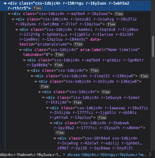
Look at the rendered code on X (formerly Twitter). It's a thick, creamy div chowder. Divs as far as the eyes can see.
There is a world of options with less code. Especially with the advancements of CSS.Even more now with subgrid gaining support in the modern browsers. If the opportunity is there, seize it!
<div id="wrapper">
  <header>...</header>
  <main>
    ...
      <section>
      ...
        <aside>
          ...
        </aside>
      </section>
  </main>
  <footer>...</footer>
</div>
If you're a dev that is stretched thin because of the inordinate amount of work you have in front of you and you feel like you are rolling a boulder uphill in an ice storm, you are not alone.
Why make it harder ? Why subject yourself to the stress? Is the extra five hours on that issue worth the four-hundred bucks you may take home?
I don't have any support.
Then you need to be the catalyst. There are a lot of resources as to how to do that. A few links to read are below, the last links has links to other articles as well.
Keys To An Accessibility Mindset
How Our Organization Improved Web Accessibility (Case Study)
Making A Strong Case For Accessibility
How To Make A Strong Case For Accessibility
Try learning semantic and accessible HTML and CSS, put as much into that as you do learning every new shiny toy that comes out monthly and you'll understand the foundations of the Web better than you ever have before. I guarantee it.


